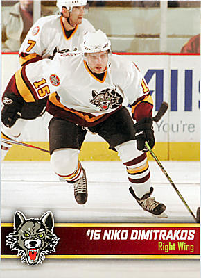
Some say the colors are great, others say the mascot is cool. The general consensus is that my ideas for a name/color change are ridiculous. I disagree, but whatever.
So, in the spirit of rational discourse, here's my list of the five best, and five worst hockey jerseys out there. Some of this is based on design. Some of it based on emotion. Most of it is just off the top of my head because, let's face it, Thanksgiving is over and I have more important things to do than troll the Internet for jerseys. Which I will start doing now.
Behold:
The five best hockey jerseys:
Chicago Blackhawks
Never
 mind the fact that I love the Hawks and am ecstatic about their return to glory. This jersey is sharp, distinguished and proud. Just ask Denis Savard about committing to the Indian. (Special consideration to the Hawks' sweet Winter Classic unis. The Wings'
 were good, too.)
2) Boston Bruins

Another Classic Original Six jersey. It's minimalist, but like all the Original Six uniforms, it's hardly changed.
3) Hartford Whalers
Simply because I love the Whale. I used to go to games at the old Hartford Civic Center to watch the likes of Pat Verbeek, Ron Francis, Kevin Dineen, Dean Evason, Mike Liut, Ulf Samuelsson, Randy Cunnywort
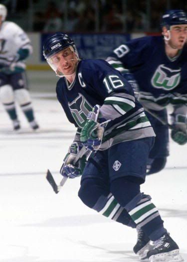 h, Paul Cyr, Geoff Sanderson - well, you get the point. I have a soft spot for the old green jerseys, but the newer blue ones were cool, too. Just as long as that wuss Paul Coffey wasn't wearing it. Jerk.
4) Old school Miami University

I'm clearly writing with my heart here. But my alma mater's old jerseys, especially the '99-'00 ones with the red shoulders are classic. Go Hawks!

5) Sweden
The Swedish National Team's jerseys are great. They say a lot without being loud. The three crowns say all they need to: We are Sweden, our women are hot and we will score goals on you.
Honorable Mention: Chicago Wolves, Rochester Americans, old NHL All-Star jerseys
The Worst
This list sums up some fugly minor league jerseys (don't worry. The Mavericks aren't on there, not even their atrocious Harry Truman sweaters).
1) Mighty Ducks of Anaheim third jersey
What the? Why the? Absurd.

2) Buffalo Sabres, mid-90s era
This jersey looks like a tomato and a black marker were put in a blender. Fail.

3)
What is this? The NBA. No, thank you.

4) Vancouver Canucks, late '70s/early '80s
'Nuff said.

5) TIE: Kansas City Blades/Chicago Blackhawks
Two of my favorite teams had two of the worst jerseys ever. The sweaters the Blades wore in their final years were an attempt to make them look m
 ean. Instead, they looked silly. I guess I just really liked their original jerseys.
The black "third" jerseys that Hawks wore up until this year were an abomination, and a nod to the lack of imaginative thinking that crippled the team for most of the last two decad
 es.
es.There you have it. Thoughts?